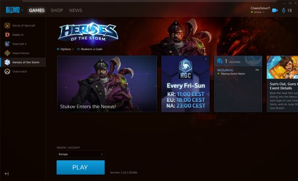
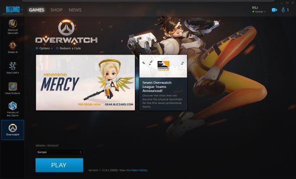
The Battle.net/Blizzard App (even they seem confused as to what they want us to call it now) interface got a fairly major update in the past couple of days. Notably, the icons used to switch which game you’re looking at were made a lot smaller. This has had two impacts: the client looks a bit uglier, and there’s room for about another six games in there.
For more baseless speculation, here are the best PC games ever made.
Here’s how the new version looks, which your client should have updated to automatically:

Here’s the old version for comparison:

As you can see, they were sorta running out of space, particularly if they were planning on slapping Destiny on there. However, far from just freeing up an extra slot, they’ve instead deliberately left a lot of blank space.
Designers hate blank space – there could be things there! Given we know big blue have multiple unannounced titles in development, including more Diablo, classic game remasters, mobile titles and others, it’s not out of the realm of possibility they’re prepping for a big reveal.
Of course, StarCraft Remastered, Destiny 2 and whatever Activision decide they’d like to put on there next are also all due in the coming months. Maybe it’s nothing. Or maybe Blizzard have an announcement lined up for today at SDCC, their usual presence at Gamescom and a BlizzCon to fill out once again this year. Just a thought.
