
I’ve never had too much time for Steam’s controller-friendly Big Picture mode. I’m happy to use a 360 pad at my desk – in fact I’ve given up even trying the keyboard and mouse controls for any port that isn’t an FPS – but didn’t feel the desperate need to operate Steam that way too. I’m also not getting a Steam controller, don’t own a TV and to me the words ‘Steam Link‘ still mean one of those fancy links that load the Steam interface despite coming from a browser. I call them “00s devil-tech.”
So I’m not exactly the target audience. However, a recent beta update has changed how the library portion of the interface works, and it’s rather good. Here’s some screenshots and why I like it.
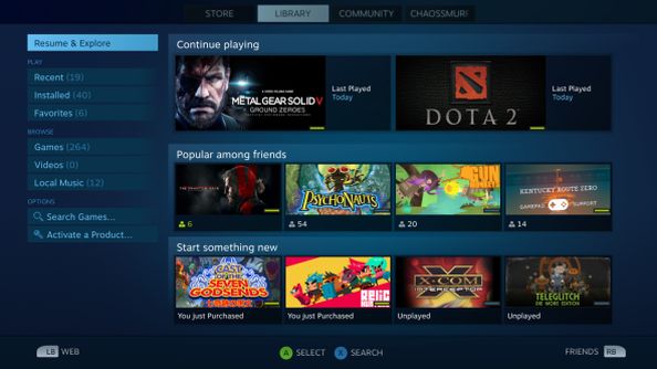
First: this is just nicely laid out. Whatever I was playing last, that’s what I’m most likely thinking of playing next. Second to that will be whatever my mates are playing – either I’ll be joining them for a multiplayer session or interested in seeing what the fuss is about. Then, and this is my favourite bit, this start something new section is exactly the sort of prompt I want every time I load up Steam. I’ll ignore it almost always, but anything that pauses my usual insta-lock to some well-worn classic is appreciated in the hope that one day, eventually, I’ll clear this backlog.
There’s also other options, including filtering:
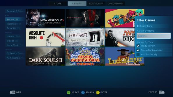
I like these two options because they’re basically “I want something to play right now, give me something to play.” I’d actually go as far as wanting a big button that I hit and it loads a random game from my library, perhaps with settings I can customise. Something I’ve never played, something I have x or less hours on, that fits into these genres. With modern internet speeds it could probably even be customised to choose games not installed, with a five minute wait for most titles more than acceptable.
Lastly, here’s the game page:
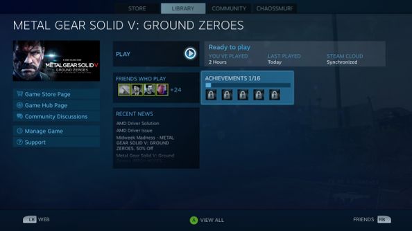
This is better laid out than the base version, in my opinion. I’d even be alright using a mouse to browse this over the sprawling mess of the main client. It’s concise, its got all the info I want and it’s possible to expand it into deeper elements if needed.
These Valve guys are pretty good at this aesthetic stuff, eh? With Steam getting ever closer to a console by itself, it’s interesting to see how things progress. The speed will likely depend on the success of the various Steam Machines coming soon.