
Calling Homeworld ahead of its time, something I’ve done before, isn’t quite accurate. It implies that, eventually, the genre would catch up, and lessons learned from Homeworld would bleed into other games. This never happened, and I don’t think it will. The two-game series, now remastered, is still unique. It’s not ahead of its time. It’s timeless.
Playing it again, 16 years after I first started the journey from Kharak and into the depths of space, has given me an even greater appreciation for what the team at Relic created. And Gearbox have smartly remastered it in a way that emphasises its most impressive characteristics.
Adagio for Strings – that’s where it all starts. That moment when the monolithic mothership is revealed with the heavens as a backdrop, with that iconic, haunting piece of music playing over it, it remains a hell of an introduction. And this scene acts like a message of intent from Gearbox. This is Homeworld as you remember it.
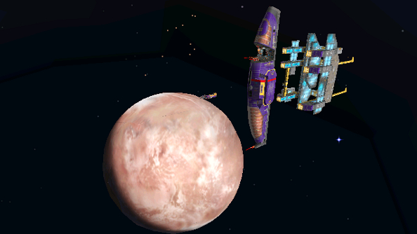
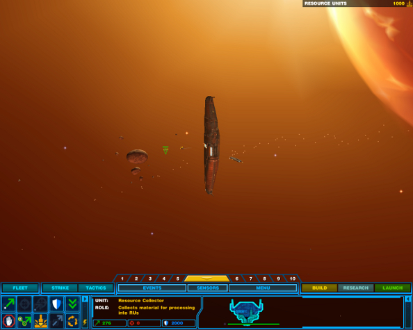
Starting off in Homeworld “Classic”:
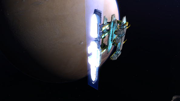
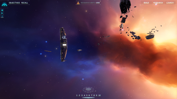
Starting off in Homeworld Remastered:
Relic made a game that has stood the test of time. Its minimalist UI and massive sense of scale have avoided the ravages of time, and the creative ship design, peculiar and vibrant in colour still stand out. What Gearbox has done is remaster it in a way so that the Remastered version simply looks like the original does in our heads. HD textures along with lighting and shadow wizardry make it look modern, but its the original design that makes it look good.
I’m certainly not writing off Gearbox’s excellent work, though. The team’s done an exceptional job with a delicate touch, always being inspired by the source. It’s an effort that’s clearly been embarked upon with a deep understanding of the original games, and the goals of both versions are aligned.
The anti-aliasing, lighting, shadows and new textures all build on the old foundations. Take the mothership, for example. It’s huge, dwarfing even the gargantuan capital ships and making fighters look like tiny gnats. The improved textures add to this scale with little details, like scratches on metal, when you zoom in, while the anti-aliasing and lighting makes it seem more solid, like a ship that was constructed by thousands of people rather than a ship model you might keep on your mantlepiece.
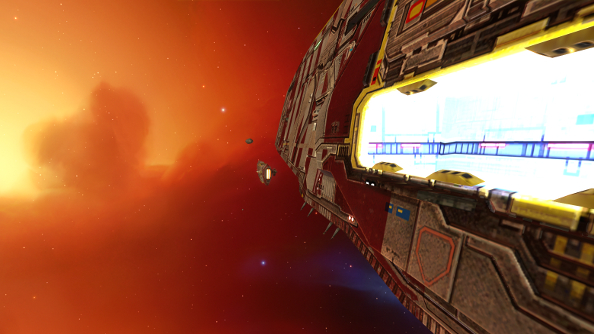
Space has been given the same amount of attention. The bewildering scope of the maps, with planets and gas clouds in the background, has been augmented. There’s more depth to the vast backdrops, they’re richer and cleaner – you can imagine flying into one of those nebulas or speeding off to one of those planets. It doesn’t feel like the background anymore.
With UHD and 4K support, the Remastered version should be as future proof as its predecessor, and with a long list of graphics options, it’s tailored for a broad variety of setups. Around 14 features can be tweaked in the graphics menu, including tiny details like battle scars and more dramatic changes like depth of field and HDR bloom.
The recommended setup suggests a 2.3GHz quad core processor and a GTX 560 or equivalent GPU, so it’s not a taxing game by any means. With my Intel i5-3570K @3.40 GHz and GTX 670, I was able to crank everything in the graphics options up to max, and got a consistent frame rate of 60, but only when zoomed out. It plummets to 30 when I put my ships under the microscope. After a bit of fiddling around, it became clear that this was down to the depth of field, and switching it to only in cinematics brought my frame rate back to 60 zoomed in or out.
Beyond the graphics magic and support for all sorts of modern rigs, most of Homeworld has been untouched, or at least not noticeably. There are new cutscenes using original art, and improved audio, but nothing that dramatically changes the gameplay through mechanics or design. Nothing other than the UI.
The original UI was an outlier in the RTS genre. It was compact and minimalist, taking up only the bottom of the screen. It would even vanish if you weren’t hovering over it, in the case of the first Homeworld. The menus, mini maps, radars and walls of icons that swallow up the real estate of most strategy games were not found in either Homeworld games, instead letting players bask in the gorgeous setting.
Original UI from Homeworld 2:
Homeworld Remastered’s UI shares this philosophy, but manages to take up even less space on the screen. Larger menus like the research and build panels are hidden away, only taking up room when they are needed, and all that’s left is a handful of small icons, spread around the borders of the screen. Hitting backspace a couple of times removes even those subtle elements. It’s a UI that doesn’t try to steal attention away from the ballet of fighters attacking in formation or huge capital ships smashing each other with broadside attacks. And, conveniently, the UI is now consistent across both games.
New UI:
This is the game that, I think, the Relic of the previous millenium would have made, had they the technology of 2015. And it lets old players re-live that 16-year-old experience without needing to put on rose-tinted glasses, while new players can appreciate it without needing to fight compatibility issues.
So, here’s the answer to the question in the title: A bloody brilliant job.