Since launch many players have talked about the unintuitive Modern Warfare 2 UI design, and how it makes little to no sense for a Call of Duty game. Presented like some sort of streaming service instead of an FPS game, navigation isn’t exactly the most difficult thing to do, but everything feels cumbersome when it should be quick and easy to hop into a multiplayer game.
While there are rumours flying around about a Modern Warfare 2 UI redesign, one fan has taken it upon themselves to try redesigning it themselves, which has both reignited discussion of the UI’s clunky nature and had fans pointing out how it can be improved. Sadly though, not even the best Modern Warfare 2 settings on PC can save you from this UI.
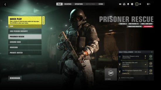
Reddit user InterventX has taken a stab at both the menus and camo menu with a new, clearer and cleaner UI, and they look pretty stunningly simple. They’ve put separate choices for campaign, multiplayer, and co-operative on the main Call of Duty HQ menu, which fills out the space for that initial menu a lot better. Thankfully the Modern Warfare 2 maps aren’t this difficult to navigate at least.

While that looks good, the Call of Duty HQ will more than likely house Warzone 2.0 and DMZ game modes when they launch soon, so we could be getting something that looks remarkably similar soon there anyway.
InterventX’s homemade Modern Warfare 2 UI really shines in the deeper menus though, and what they’ve mainly done is declutter the screen and taken away it’s big streaming service-like boxes, with navigation being treating in a more linear fashion, instead of it feeling like you need to discover something right at the bottom of the screen.
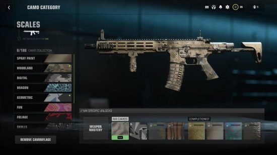
There’s even a new take on Modern Warfare 2 camos as well, which again does away with the big blocks and replaces them with a scrolling list that’s faster to cycle through, leaving most of the screen for the gun itself. These are some basic Modern Warfare UI changes, but they show how many players dislike the style currently implemented in the game, and the types of things that could make the UI look better.

While it’s difficult to pin down why the Modern Warfare 2 UI looks the way it does, the old director of UX product design at streaming service Hulu, William Faler, moved to Infinity Ward in 2020 to be UX/UI director. Many Hulu users also touted problems when using the service on consoles and other similar devices, so it seems like some of the same flaws have bled over into the Modern Warfare 2 UI.
Complaints about the Modern Warfare 2 UI have been making the rounds since launch, and I have to say I agree with them. Why on earth does each game have a big box with its name in, but nowhere does it tell you what the game mode actually is? I also don’t get why the UI has been designed for you to actively struggle to look for weapon unlock orders. Figuring out the lineage for gun unlocks is both a chore and confusing, instead of just being clearly displayed on one screen.
You can check out all of InterventX’s design’s on their Reddit account here.
If you need some help with the shooter we’ve got your six with some great guides, like a look at how to level up fast in Modern Warfare 2, or a breakdown of how to get Modern Warfare 2 double XP tokens easily in the game.
